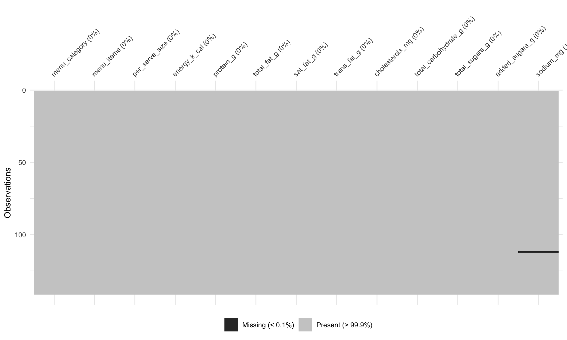
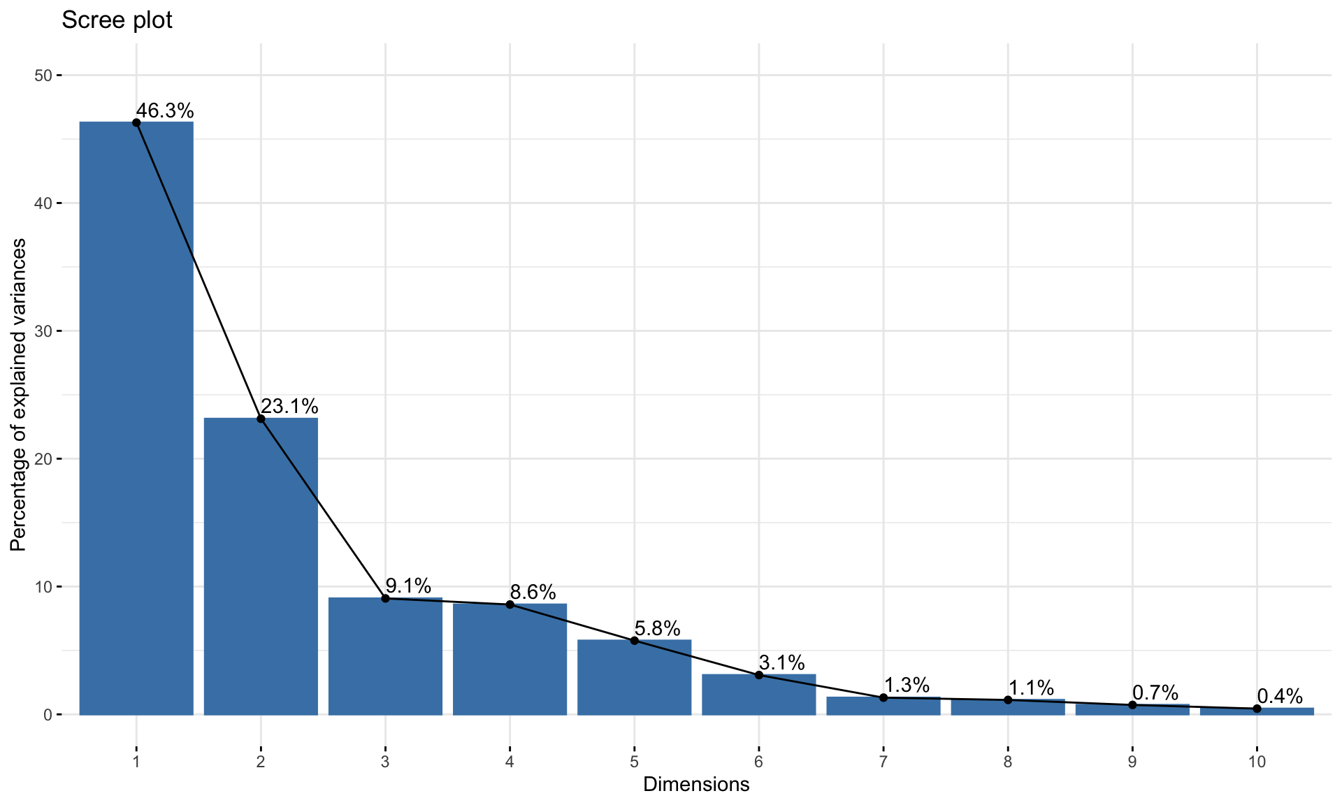
EDA: McDonalds India

Visualization
EDA
Exploration of McDonalds India data from a Kaggle dataset
Author

Rahul

Published

August 1, 2022

Introduction

Welcome to an EDA of the McDonald’s India Menu - Nutrition dataset, uploaded by Deep Contractor.

You don’t have to be a health expert to know fast food isn’t good for you. But, how bad is it truly? Can we find patterns in the design of their menu? Let’s explore.

Initial Setup

Libraries

Code
# Data Manipulation
library(dplyr)
library(tidyr)
library(readr)
library(skimr)
library(purrr)
library(stringr)
library(urltools)
library(magrittr)

# Plots
library(ggplot2)
library(naniar)
library(packcircles)
library(ggridges)
library(ggbeeswarm)
library(patchwork)

# PCA
if(!require(FactoMineR))
  remotes::install_cran("FactoMineR")
if(!require(factoextra))
  remotes::install_cran("factoextra")
library(FactoMineR)
library(factoextra)

# Tables
library(reactable)

# Settings
theme_set(theme_minimal(
  base_size = 13,
  base_family = "Menlo"))
theme_update(
  plot.title.position = "plot"
)

Read In

Let’s start be reading in the data. There is only one CSV file, with the menu items and some measurements on each item. {janitor::clean_names} helps us get clean column names quickly.

Code
dat <- read_csv("input/mcdonalds-india-menu-nutrition-facts/India_Menu.csv") %>% 
  janitor::clean_names()
glimpse(dat, 100)
Rows: 141
Columns: 13
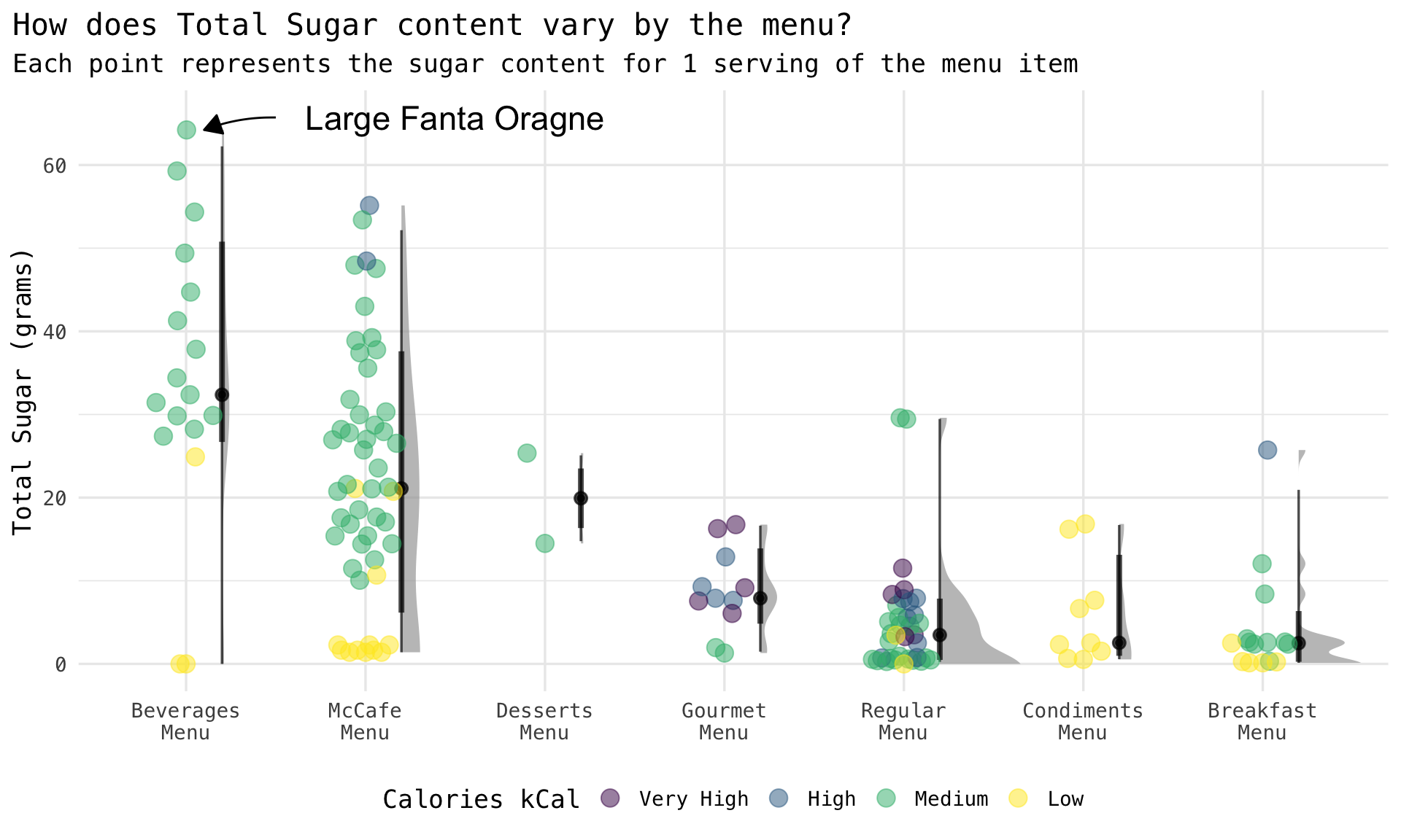
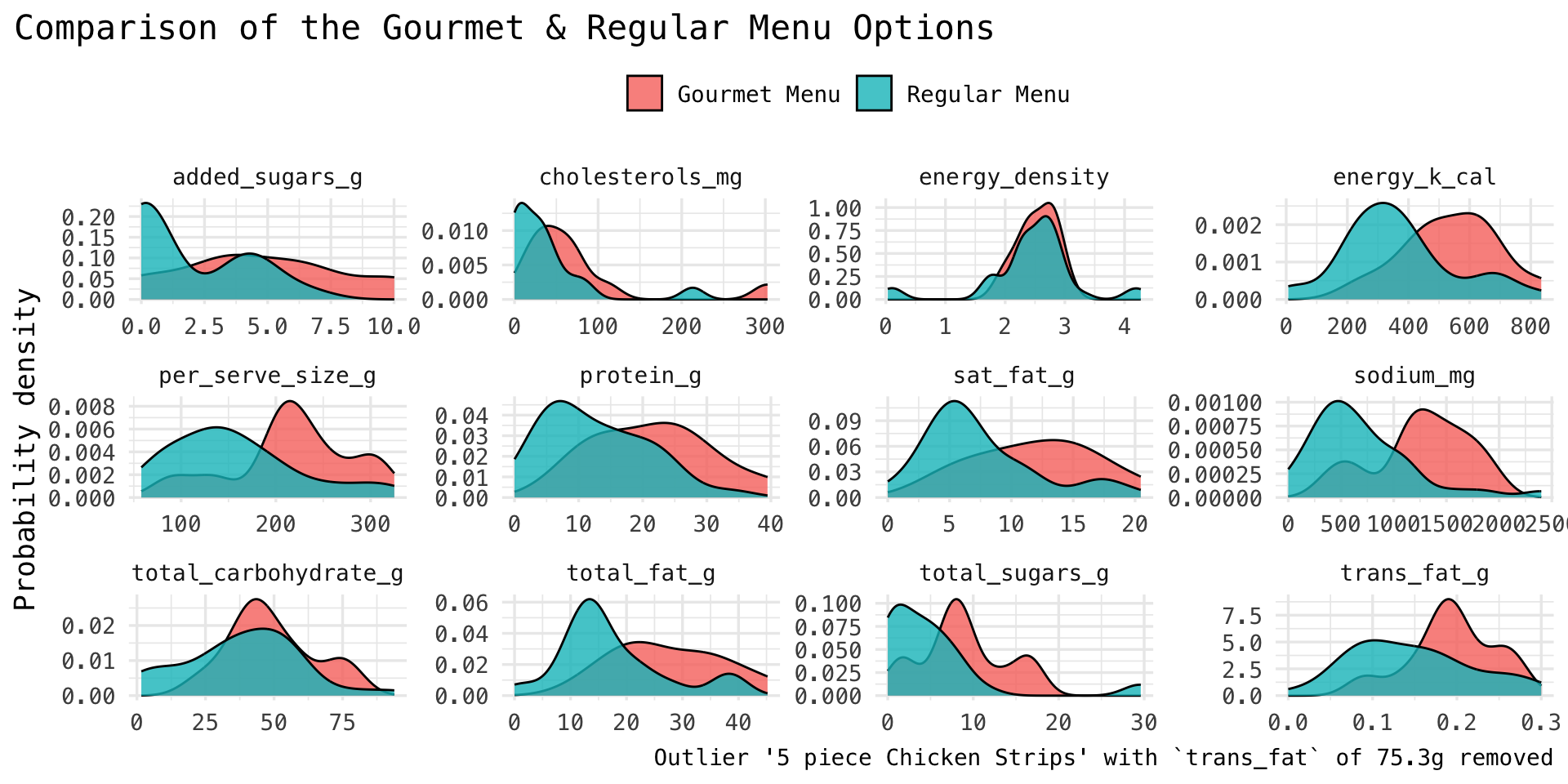
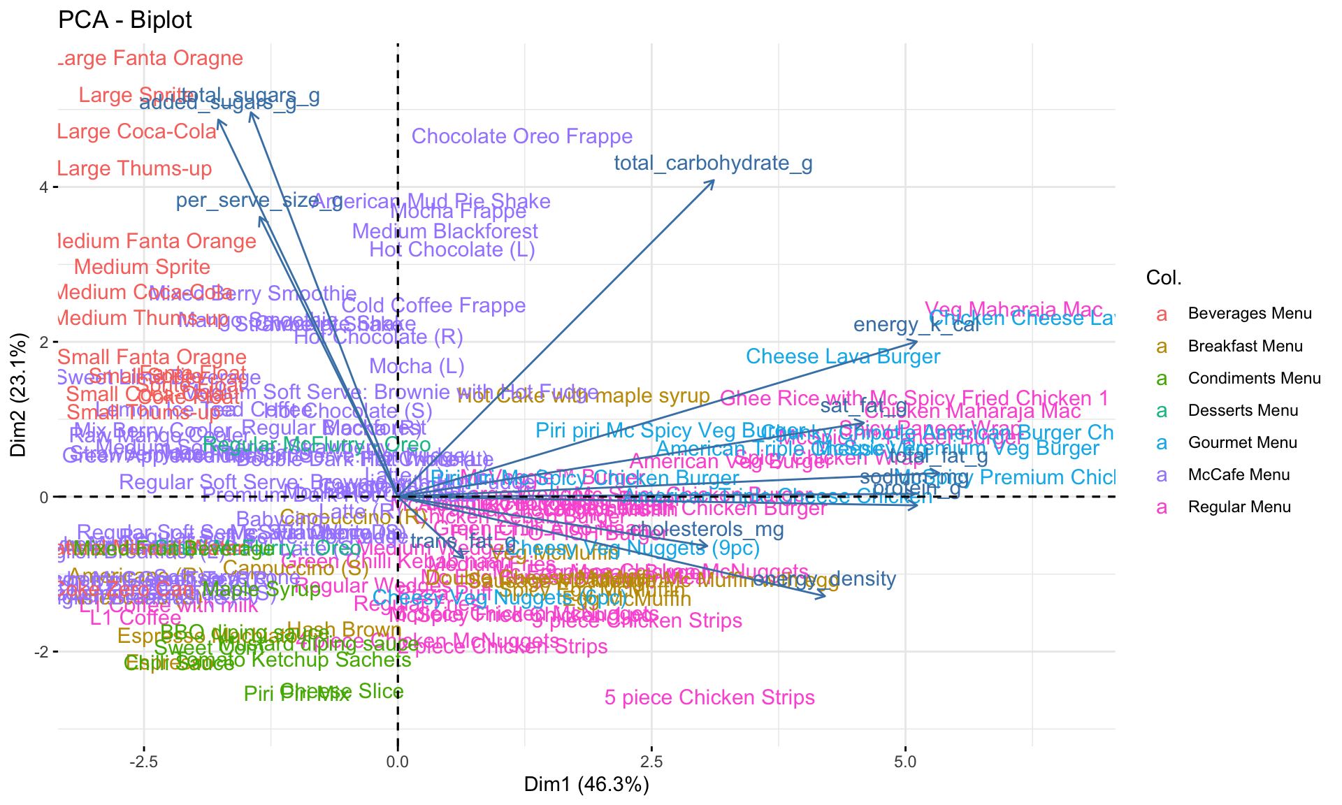
$ menu_category        <chr> "Regular Menu", "Regular Menu", "Regular Menu", "Regular Menu", "Regu…
$ menu_items           <chr> "McVeggie™ Burger", "McAloo Tikki Burger®", "McSpicy™ Paneer Burger",…
$ per_serve_size       <chr> "168 g", "146 g", "199 g", "250 g", "177 g", "306 g", "132 g", "87 g"…
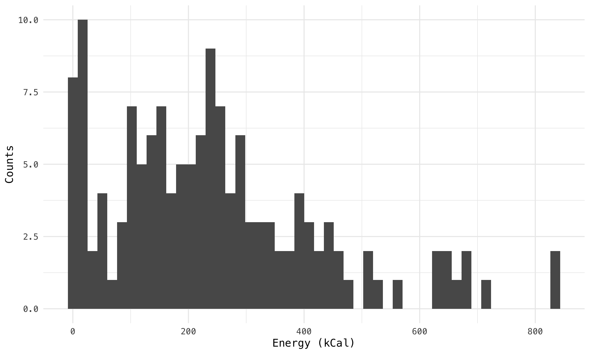
$ energy_k_cal         <dbl> 402.05, 339.52, 652.76, 674.68, 512.17, 832.67, 356.09, 228.21, 400.8…
$ protein_g            <dbl> 10.24, 8.50, 20.29, 20.96, 15.30, 24.17, 7.91, 5.45, 15.66, 15.44, 21…
$ total_fat_g          <dbl> 13.83, 11.31, 39.45, 39.10, 23.45, 37.94, 15.08, 11.44, 15.70, 14.16,…
$ sat_fat_g            <dbl> 5.34, 4.27, 17.12, 19.73, 10.51, 16.83, 6.11, 5.72, 5.47, 5.79, 7.63,…
$ trans_fat_g          <dbl> 0.16, 0.20, 0.18, 0.26, 0.17, 0.28, 0.24, 0.09, 0.16, 0.21, 0.18, 0.2…
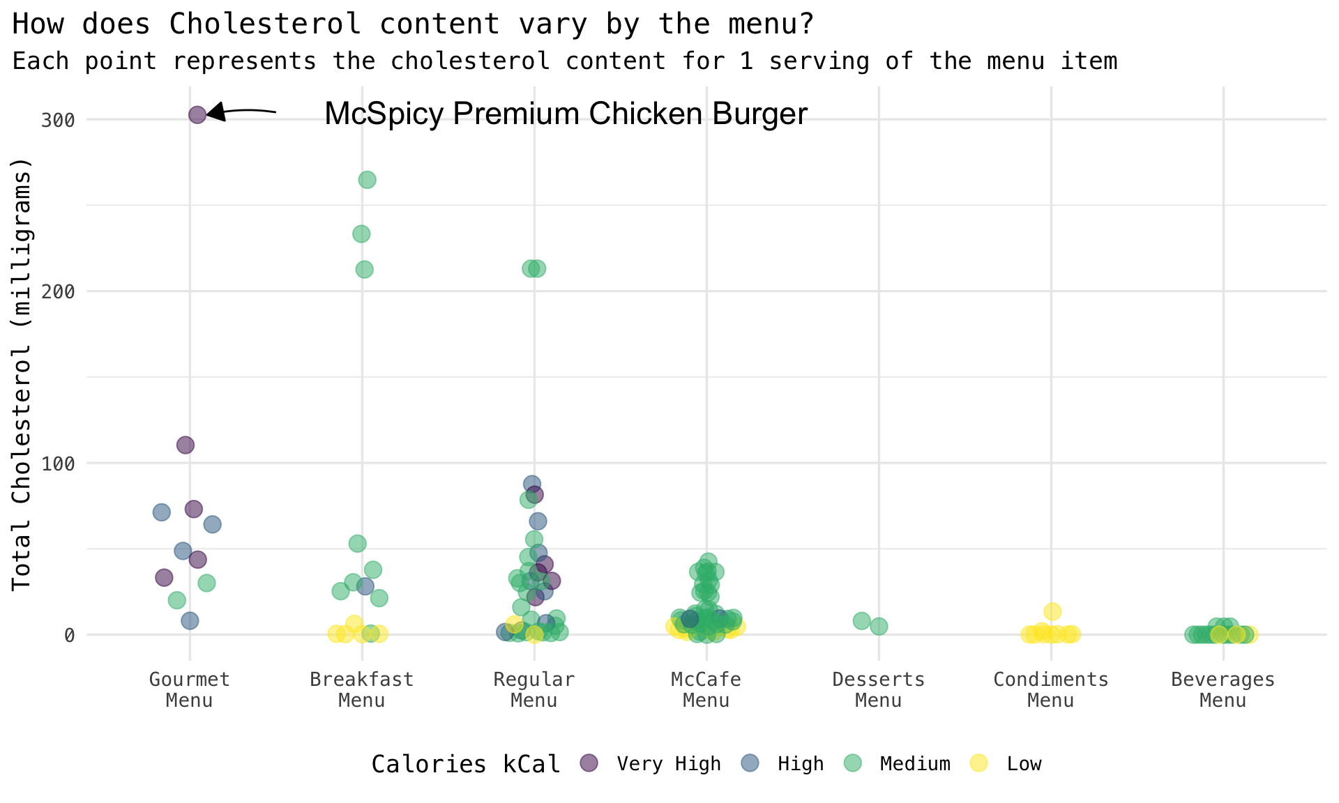
$ cholesterols_mg      <dbl> 2.49, 1.47, 21.85, 40.93, 25.24, 36.19, 9.45, 5.17, 31.17, 32.83, 66.…
$ total_carbohydrate_g <dbl> 56.54, 50.27, 52.33, 59.27, 56.96, 93.84, 46.36, 24.79, 47.98, 38.85,…
$ total_sugars_g       <dbl> 7.90, 7.05, 8.35, 3.50, 7.85, 11.52, 4.53, 2.73, 5.53, 5.58, 5.88, 2.…
$ added_sugars_g       <dbl> 4.49, 4.07, 5.27, 1.08, 4.76, 6.92, 1.15, 0.35, 4.49, 3.54, 4.49, 1.0…
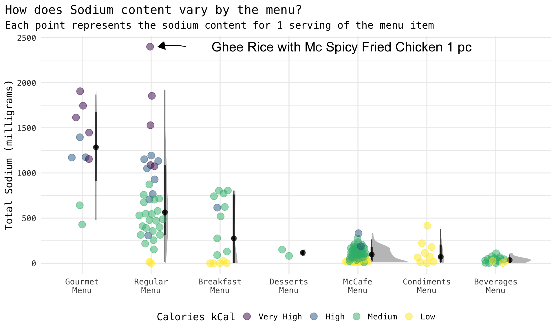
$ sodium_mg            <dbl> 706.13, 545.34, 1074.58, 1087.46, 1051.24, 1529.22, 579.60, 390.74, 7…

Quick View

I love to take the first peek into a dataset with the amazing {skimr} package. Few takeaways:

  • per_serve_size doesn’t sound like it should be of type character
  • no missing values except for sodium_mg
Code
skimr::skim(dat)
Data summary
Name dat
Number of rows 141
Number of columns 13
_______________________
Column type frequency:
character 3
numeric 10
________________________
Group variables None

Variable type: character

skim_variable n_missing complete_rate min max empty n_unique whitespace
menu_category 0 1 11 15 0 7 0
menu_items 0 1 8 42 0 141 0
per_serve_size 0 1 3 9 0 107 0

Variable type: numeric

skim_variable n_missing complete_rate mean sd p0 p25 p50 p75 p100 hist
energy_k_cal 0 1.00 244.64 185.55 0 116.36 219.36 339.52 834.36 ▇▇▃▁▁
protein_g 0 1.00 7.49 8.34 0 0.65 4.79 10.88 39.47 ▇▃▁▁▁
total_fat_g 0 1.00 9.99 10.34 0 0.46 7.77 14.16 45.18 ▇▅▂▁▁
sat_fat_g 0 1.00 5.00 4.90 0 0.28 4.27 7.28 20.46 ▇▅▂▁▁
trans_fat_g 0 1.00 0.69 6.33 0 0.06 0.15 0.22 75.26 ▇▁▁▁▁
cholesterols_mg 0 1.00 26.35 50.33 0 1.51 8.39 31.11 302.61 ▇▁▁▁▁
total_carbohydrate_g 0 1.00 31.19 20.60 0 15.74 30.82 46.00 93.84 ▇▇▆▂▁
total_sugars_g 0 1.00 15.46 15.69 0 2.33 9.16 26.95 64.22 ▇▂▂▁▁
added_sugars_g 0 1.00 10.34 14.28 0 0.00 3.64 19.23 64.22 ▇▂▁▁▁
sodium_mg 1 0.99 362.06 473.16 0 43.90 152.02 534.24 2399.49 ▇▂▁▁▁

Data Quality

My favorite way of exploring missing data is to make it visible, using Nick Tierney’s amazing {naniar} package.

We can see the missing sodium_mg rows here.

Code
dat %>% 
  vis_miss()

Interesting Questions

Since this is an open ended exploration, I will posit some questions which will guide the flow of further work.

  1. Which are the unhealthiest menu options, measured in terms of total fat content, total sugar, cholesterol, or sodium?
  2. Which are the most and least energy dense options?
  3. How does the Gourmet Menu differ from the Regular Menu?
  4. What patterns or clusters exist, if any, which can give us a clearer picture of this menu?

Feature Development

To aid answering many of these, I first need to create a few new features in the data set.

We go from 13 columns to 15 columns in the data set.

Serving Size

The serving size by default is a character, with the units (g) embedded in the column. Let’s clean this up, and rename the column to our convention {measurement}_{unit}.

Code
dat <- dat %>% 
  mutate(per_serve_size = as.numeric(stringr::str_extract(per_serve_size, "\\d*"))) %>% 
  rename(per_serve_size_g = per_serve_size)
glimpse(dat, 80)
Rows: 141
Columns: 13
$ menu_category        <chr> "Regular Menu", "Regular Menu", "Regular Menu", "…
$ menu_items           <chr> "McVeggie™ Burger", "McAloo Tikki Burger®", "McSp…
$ per_serve_size_g     <dbl> 168, 146, 199, 250, 177, 306, 132, 87, 173, 136, …
$ energy_k_cal         <dbl> 402.05, 339.52, 652.76, 674.68, 512.17, 832.67, 3…
$ protein_g            <dbl> 10.24, 8.50, 20.29, 20.96, 15.30, 24.17, 7.91, 5.…
$ total_fat_g          <dbl> 13.83, 11.31, 39.45, 39.10, 23.45, 37.94, 15.08, …
$ sat_fat_g            <dbl> 5.34, 4.27, 17.12, 19.73, 10.51, 16.83, 6.11, 5.7…
$ trans_fat_g          <dbl> 0.16, 0.20, 0.18, 0.26, 0.17, 0.28, 0.24, 0.09, 0…
$ cholesterols_mg      <dbl> 2.49, 1.47, 21.85, 40.93, 25.24, 36.19, 9.45, 5.1…
$ total_carbohydrate_g <dbl> 56.54, 50.27, 52.33, 59.27, 56.96, 93.84, 46.36, …
$ total_sugars_g       <dbl> 7.90, 7.05, 8.35, 3.50, 7.85, 11.52, 4.53, 2.73, …
$ added_sugars_g       <dbl> 4.49, 4.07, 5.27, 1.08, 4.76, 6.92, 1.15, 0.35, 4…
$ sodium_mg            <dbl> 706.13, 545.34, 1074.58, 1087.46, 1051.24, 1529.2…

Calorie Counts

I want to explore some of the data using calories as a covariate. Here’s the distribution of calories:

Code
ggplot(dat, aes(x = energy_k_cal)) +
  geom_histogram(bins = 50) +
  labs(
    x = "Energy (kCal)",
    y = "Counts"
  )

I’ll use this distribution as a guide to create some bins for the energy column.

Code
dat <- dat %>% 
  mutate(
    cal_cat = case_when(
      energy_k_cal <= 100 ~ "Low",
      energy_k_cal > 100 & energy_k_cal <= 400 ~ "Medium",
      energy_k_cal > 400 & energy_k_cal <= 600 ~ "High",
      energy_k_cal > 600 ~ "Very High"
    ),
    cal_cat = factor(cal_cat, levels = c("Very High", "High", "Medium", "Low"), ordered = TRUE)
  )
glimpse(dat, 80)
Rows: 141
Columns: 14
$ menu_category        <chr> "Regular Menu", "Regular Menu", "Regular Menu", "…
$ menu_items           <chr> "McVeggie™ Burger", "McAloo Tikki Burger®", "McSp…
$ per_serve_size_g     <dbl> 168, 146, 199, 250, 177, 306, 132, 87, 173, 136, …
$ energy_k_cal         <dbl> 402.05, 339.52, 652.76, 674.68, 512.17, 832.67, 3…
$ protein_g            <dbl> 10.24, 8.50, 20.29, 20.96, 15.30, 24.17, 7.91, 5.…
$ total_fat_g          <dbl> 13.83, 11.31, 39.45, 39.10, 23.45, 37.94, 15.08, …
$ sat_fat_g            <dbl> 5.34, 4.27, 17.12, 19.73, 10.51, 16.83, 6.11, 5.7…
$ trans_fat_g          <dbl> 0.16, 0.20, 0.18, 0.26, 0.17, 0.28, 0.24, 0.09, 0…
$ cholesterols_mg      <dbl> 2.49, 1.47, 21.85, 40.93, 25.24, 36.19, 9.45, 5.1…
$ total_carbohydrate_g <dbl> 56.54, 50.27, 52.33, 59.27, 56.96, 93.84, 46.36, …
$ total_sugars_g       <dbl> 7.90, 7.05, 8.35, 3.50, 7.85, 11.52, 4.53, 2.73, …
$ added_sugars_g       <dbl> 4.49, 4.07, 5.27, 1.08, 4.76, 6.92, 1.15, 0.35, 4…
$ sodium_mg            <dbl> 706.13, 545.34, 1074.58, 1087.46, 1051.24, 1529.2…
$ cal_cat              <ord> High, Medium, Very High, Very High, High, Very Hi…

Energy Density

Finally, I’ll add a feature called energy density, which is the number of calories per weight of food. I suspect things like cookies and cake (perhaps even the fizzy drinks?) would rank high on this feature.

Code
dat <- dat %>% 
  mutate(
    energy_density = energy_k_cal / per_serve_size_g
  )
glimpse(dat, 80)
Rows: 141
Columns: 15
$ menu_category        <chr> "Regular Menu", "Regular Menu", "Regular Menu", "…
$ menu_items           <chr> "McVeggie™ Burger", "McAloo Tikki Burger®", "McSp…
$ per_serve_size_g     <dbl> 168, 146, 199, 250, 177, 306, 132, 87, 173, 136, …
$ energy_k_cal         <dbl> 402.05, 339.52, 652.76, 674.68, 512.17, 832.67, 3…
$ protein_g            <dbl> 10.24, 8.50, 20.29, 20.96, 15.30, 24.17, 7.91, 5.…
$ total_fat_g          <dbl> 13.83, 11.31, 39.45, 39.10, 23.45, 37.94, 15.08, …
$ sat_fat_g            <dbl> 5.34, 4.27, 17.12, 19.73, 10.51, 16.83, 6.11, 5.7…
$ trans_fat_g          <dbl> 0.16, 0.20, 0.18, 0.26, 0.17, 0.28, 0.24, 0.09, 0…
$ cholesterols_mg      <dbl> 2.49, 1.47, 21.85, 40.93, 25.24, 36.19, 9.45, 5.1…
$ total_carbohydrate_g <dbl> 56.54, 50.27, 52.33, 59.27, 56.96, 93.84, 46.36, …
$ total_sugars_g       <dbl> 7.90, 7.05, 8.35, 3.50, 7.85, 11.52, 4.53, 2.73, …
$ added_sugars_g       <dbl> 4.49, 4.07, 5.27, 1.08, 4.76, 6.92, 1.15, 0.35, 4…
$ sodium_mg            <dbl> 706.13, 545.34, 1074.58, 1087.46, 1051.24, 1529.2…
$ cal_cat              <ord> High, Medium, Very High, Very High, High, Very Hi…
$ energy_density       <dbl> 2.393155, 2.325479, 3.280201, 2.698720, 2.893616,…

Graphical EDA

Now that I have the data sets prepared and ready, it’s time for the fun part - being creative and creating some interesting visuals!

There are four components to the EDA below:

  1. Unhealthiest menu exploration
  2. Energy dense foods exploration
  3. Gourmet vs Regular menu exploration
  4. Principal Component Analysis for multivariate exploration
Code
# Custom plotting functions

make_dot_violin_plot <- function(dat,
                                 title = NULL,
                                 xlab = NULL,
                                 ylab = NULL,
                                 subtitle = NULL,
                                 legend_title = NULL,
                                 n_outliers = 1,
                                 annot_xnudge = 0.1,
                                 annot_xoffset = 0.5,
                                 annot_ynudge = 10,
                                 annot_curv = 0.2,
                                 label_size = 6,
                                 he_width = 0.5,
                                 he_alpha = 0.7,
                                 pt_size = 4,
                                 pt_width = 0.2,
                                 pt_alpha = 0.5){
  
  
  pdat <- dat %>%
    mutate(colorby = forcats::fct_reorder(str_wrap(colorby, 10), -y))
  
  outlier <- pdat %>% 
    arrange(-y) %>% 
    slice(n_outliers)
  
  g <- pdat %>% 
    ggplot(aes(x = forcats::fct_reorder(colorby, -y),
               y = y)) +
    ggdist::stat_halfeye(
      aes(thickness = stat(f * n)),
      width = he_width,
      position = position_nudge(x = .2),
      alpha = he_alpha
    ) +
    geom_quasirandom(
      aes(color = cat),
      size = pt_size,
      width = pt_width,
      alpha = pt_alpha,
      varwidth = TRUE
    ) +
    ggtitle(title) +
    labs(
      x = xlab,
      y = ylab,
      subtitle = subtitle,
      color = legend_title
    ) +
    theme(legend.position = "bottom")
  
  if (n_outliers > 0) {
    g <- g +
      annotate(
        "curve",
        x = as.numeric(outlier$colorby) + annot_xoffset,
        xend = as.numeric(outlier$colorby) + annot_xnudge,
        y = outlier$y + annot_ynudge,
        yend = outlier$y,
        curvature = annot_curv,
        arrow = arrow(length = unit(10, "pt"),
                      type = "closed")
      ) +
      annotate(
        "text",
        x = as.numeric(outlier$colorby) + annot_xoffset,
        y = outlier$y + annot_ynudge,
        label = outlier$menu_items,
        size = label_size,
        hjust = -0.1
      )
  }
  g
}

Unhealthiest Menu Options

Q: Which are the unhealthiest menu options, measured in terms of total fat content, total sugar, cholesterol, or sodium?

The plots below, each a combination of a jitter plot & a half-eye plot (itself is a combination of a density and an interval plot), are quite information rich.

The individual points allow us to see each data point, look for groupings if any and identify outliers. The density plot gives a visual for the each group’s clustering. The interval plot gives us a quick understanding of the median point (the black dot), as well as the quantiles (the thick & thin lines).

The X-axis is split by the Menu type while the colors are for the binned Calories feature I created.

For each graph, I’ve also found the largest outlier and put a little annotation for what the item is.

Fats

  • Highest Calories also have the highest fat content
  • Gourmet menu, expectedly, is rich in fat
  • Beverages, expectedly, are the least fatty
  • Breakfast and McCafe menu’s show a bi-modal distribution
Code
dat %>% 
  select(y = total_fat_g, cat = cal_cat, colorby = menu_category, menu_items) %>% 
  make_dot_violin_plot(
    title = "How does Total Fat content vary by the menu?",
    ylab = "Total Fat (grams)",
    subtitle = "Each point represents the fat content for 1 serving of the menu item",
    legend_title = "Calories kCal",
    n_outliers = 1,
    annot_ynudge = 1.5,
    annot_curv = 0.1
  )

Sugars

  • Beverages, expectedly, are the worst. 60g of sugar for a large fanta!
  • McCafe menu’s - which are sold as breakfast items - are surprisingly sugary
Code
dat %>% 
  select(y = total_sugars_g, cat = cal_cat, colorby = menu_category, menu_items) %>% 
  make_dot_violin_plot(
    title = "How does Total Sugar content vary by the menu?",
    ylab = "Total Sugar (grams)",
    subtitle = "Each point represents the sugar content for 1 serving of the menu item",
    legend_title = "Calories kCal",
    n_outliers = 1,
    annot_ynudge = 1.5,
    annot_curv = 0.1
  )

Sodium

This one really makes the skin crawl. The amount of sodium in the regular and gourmet menus should be a cause for concern for anyone consuming these on any regular basis. Considering the average recommended sodium is 2,300 mg per day, consuming a Ghee Rice with the Spicy Chicken would violate that in a single meal.

Code
dat %>% 
  select(y = sodium_mg, cat = cal_cat, colorby = menu_category, menu_items) %>% 
  tidyr::drop_na() %>% 
  make_dot_violin_plot(
    he_width = .6,
    title = "How does Sodium content vary by the menu?",
    ylab = "Total Sodium (milligrams)",
    subtitle = "Each point represents the sodium content for 1 serving of the menu item",
    legend_title = "Calories kCal",
    n_outliers = 1,
    annot_ynudge = 1.5,
    annot_curv = 0.1
  )

Cholesterol

Quite a few outliers here, for the gourmet, breakfast and regular menus. The popular Spicy Chicken burger is certainly the worst.

Code
dat %>% 
  select(y = cholesterols_mg, cat = cal_cat, colorby = menu_category, menu_items) %>% 
  make_dot_violin_plot(
    he_width = 1.5,
    title = "How does Cholesterol content vary by the menu?",
    ylab = "Total Cholesterol (milligrams)",
    subtitle = "Each point represents the cholesterol content for 1 serving of the menu item",
    legend_title = "Calories kCal",
    n_outliers = 1,
    annot_ynudge = 1.5,
    annot_curv = 0.1
  )

Carbohydrates

Carbs are high, unsurprisingly, across the board for the McD menu.

Code
dat %>% 
  select(y = total_carbohydrate_g, cat = cal_cat, colorby = menu_category, menu_items) %>% 
  make_dot_violin_plot(
    he_width = .65,
    title = "How does Carbohydrate content vary by the menu?",
    ylab = "Total Carbohydrate (grams)",
    subtitle = "Each point represents the carbohydrate content for 1 serving of the menu item",
    legend_title = "Calories kCal",
    n_outliers = 1,
    annot_ynudge = 1.5,
    annot_curv = 0.1
  )

Energy Dense Foods

Aha! As I suspected, the Muffins are the worst offenders for calories/gram of food. However, look at the Condiments! Those little ketchup and mustard packets are super energy dense!

Code
dat %>% 
  select(y = energy_density, cat = cal_cat, colorby = menu_category, menu_items) %>% 
  make_dot_violin_plot(
    he_width = 1.5,
    title = "How does Carbohydrate content vary by the menu?",
    ylab = "Total Carbohydrate (grams)",
    subtitle = "Each point represents the carbohydrate content for 1 serving of the menu item",
    legend_title = "Calories kCal",
    n_outliers = 1,
    annot_ynudge = 0.15,
    annot_curv = -0.1 
  )

Gourmet vs Regular

Q: How does the Gourmet Menu differ from the Regular Menu?

Across the board, the Gourmet menu has items with higher values. Except Energy Density, all the other metrics are right-shifted. This is expected, as Gourmet items are regular items with extra oomph!

Code
dat %>%
  filter(menu_category %in% c("Regular Menu", "Gourmet Menu")) %>%
  filter(trans_fat_g < 20) %>% 
  select(menu_category, where(is.numeric)) %>%
  tidyr::pivot_longer(-menu_category) %>%
  ggplot(aes(x = value,
             fill = menu_category)) +
  geom_density(alpha = 0.8) +
  facet_wrap(~ name,
             scales = "free"
  ) +
  ggtitle(
    label = "Comparison of the Gourmet & Regular Menu Options"
  ) +
  labs(
    x = NULL,
    y = "Probability density",
    fill = NULL,
    caption = "Outlier '5 piece Chicken Strips' with `trans_fat` of 75.3g removed"
  ) +
  theme(legend.position = "top",
        plot.subtitle = element_text(face = "italic"))

Principal Component Analysis

One of my favorite methods of looking at multivariate numerical data is the simple, yet powerful tool - PCA. It’s a great way to extract layers upon layers of information about the dataset from just a few plots. Let’s explore this dataset using PCA.

At a high-level, here is the workflow:

  1. Calculate the principal components
  2. Explore the variables on a correlation circle
  3. Explore the individual observations on a biplot

We can throw in some clustering and data manipulation to get a pretty rich understanding of these data.

Calc Components

Here, I’m calculating the principal components on a scaled data set of the numeric features. I’m imputing the missing values of sodium to the median value. prcomp() is a popular method, but I like the FactoMineR::PCA() method which offers some great features for post processing.

Code
dat %>% 
  select(where(is.numeric)) %>%
  # Impute the missing sodium_mg values to the median
  mutate(sodium_mg = ifelse(is.na(sodium_mg), median(sodium_mg, na.rm = TRUE), sodium_mg)) %>% 
  scale() %>% 
  as.data.frame() -> dat_scaled
rownames(dat_scaled) <- dat$menu_items
pca <- PCA(dat_scaled, graph = FALSE)
pca
**Results for the Principal Component Analysis (PCA)**
The analysis was performed on 141 individuals, described by 12 variables
*The results are available in the following objects:

   name               description                          
1  "$eig"             "eigenvalues"                        
2  "$var"             "results for the variables"          
3  "$var$coord"       "coord. for the variables"           
4  "$var$cor"         "correlations variables - dimensions"
5  "$var$cos2"        "cos2 for the variables"             
6  "$var$contrib"     "contributions of the variables"     
7  "$ind"             "results for the individuals"        
8  "$ind$coord"       "coord. for the individuals"         
9  "$ind$cos2"        "cos2 for the individuals"           
10 "$ind$contrib"     "contributions of the individuals"   
11 "$call"            "summary statistics"                 
12 "$call$centre"     "mean of the variables"              
13 "$call$ecart.type" "standard error of the variables"    
14 "$call$row.w"      "weights for the individuals"        
15 "$call$col.w"      "weights for the variables"          

We can see that the 1st two PCs account for ~70% of variation in the numerical data. Not too shabby!

Code
fviz_eig(pca, addlabels = TRUE, ylim = c(0, 50))

Explore Variables

The ‘variable correlation plot’ or ‘correlation circle plot’ is an insightful plot. It shows the relationships between all the features. Summarizing from this article:

  • Positively correlated variables are grouped together.
  • Negatively correlated variables are positioned on opposite sides of the origin.
  • Distance between variables and the origin measures the quality of the variables, variables that are away from the origin are well represented.

What are the takeaways?

  1. We can see 6 distinct clusters of features, which I’ve highlighted in the plot after running kmeans on the coordinates of the two principal component loadings of the features.
    • Sugars and serving size are highly correlated
    • Carb is on it’s own
    • Calories and Saturated Fat are correlated
    • As are the Total Fat, Sodium and Proteins
    • Cholesterol and energy density are correlated
  2. Almost all the features (except trans fat, and perhaps cholesterol) are heavily loaded in the 1st two PCs (i.e., they are close to the correlation circle), which means they’re all actively participating in these components.
  3. Proteins, total fat, and sodium are slightly negatively correlated with features like total sugars and added sugars.
Code
clusts <- kmeans(pca$var$coord[,1:2], 6, nstart = 50)

fviz_pca_var(
  pca,
  repel = TRUE,
  col.var = as.factor(clusts$cluster),
  legend.title = "Cluster"
)

Explore Individuals

Now that we’ve looked at the features, let’s look at the individual data points on the 1st two PCs.

First, we plot just the points across PC1 and PC2. Immediately, we can see distinct clusters for each of the Menu types. On the left, the drinks form an unusually straight line parallel to PC2 - notice how the smalls are towards the x-axis, and large drinks on top. McCafe menu items take the center-half of the plot. Condiments occupy the 3rd quadrant, while the regular and gourmet menu are spread across and 1st and 4th quadrant.

Code
fviz_pca_ind(pca,
             col.ind = dat$menu_category,
             select.ind = list(cos2 = 0.5))

Now, if we superimpose the feature loadings on top of the plot above, we can extract quite a few insights.

  • beverages certainly follow the sugars vectors from small to large
  • ‘Chicken Cheese Lava Burger’ and ‘Veg Maharaja Mac’ have the highest calorie counts
  • The chicken burgers have the highest protein content, as expected
  • The McCafe menus have moderate sugars but also moderate carbs

Remember, the axes center (0,0) indicate the region of average values for the principal component loadings. i.e., individual data points close to the axis will tend to have values close to the average of the dataset.

Code
fviz_pca_biplot(
  pca,
  col.ind = dat$menu_category,
  geom.ind = "text"
)

We can roughly call Principal Component 1 (Dim1) as the ‘fats, proteins and calories’ axis, while Principal Component 2 (Dim2) is the ‘sugars and carbs’ axis. Another way to look at the two dims is using a factor contribution plot, like the one below.

Code
p1 <- fviz_contrib(pca, choice = "var", axes = 1, top = 10)
p2 <- fviz_contrib(pca, choice = "var", axes = 2, top = 10)
p1/p2


That was a fun exploration of these data.

Cheers!


Subscribe to my newsletter!